Between April and August I wrote twelve sets of instructions for an AI assistant: one for building screens, one for turning them into something clickable, one for adding pieces to our design system, and so on. They have been used 196 times. Exactly one other person has ever run one.
That last number is the article. Getting a machine to do a job well is the half that feels like an achievement. Getting it to do that job for somebody who was not standing there while you taught it is where nearly all of my five months went.
An instruction file is not a prompt
A plain text file, nothing more: this is the job, this is when to use it, these are the references to read first, this is what you must never do, this is what finished looks like. The assistant reads the file before it starts.
The difference from a prompt is not the wording. It is what happens when something goes wrong. A conversation cannot be fixed; a file can. You do not resolve to phrase it better next time, because next time you will be tired and in a hurry. You change three lines, and every run after that is different.
-
Asking fresh each time eight runs, eight different answers
-
A prompt you saved better, but it lives in your head, and only in yours
-
An instruction file one good answer, every run, for everyone
Each column above is one run of the same brief.
How they got built
I never set out to write twelve. I wrote the first file to do a single job: take a written description of a new feature and turn it into finished screens.
It worked, and it got three things wrong. The text was not linked to our shared type styles. One background used a hand-picked colour instead of one from our kit. The icons were grey placeholder squares.
Three days later I wrote a second file whose only job was to go looking for those three faults. The first time it ran, over a single screen, it found fifteen.
That became the method and it never changed. Make something. Write down what went wrong. Then change a file so that kind of mistake cannot happen again. Every file I have exists because something broke first, and the ones I tried to imagine in advance are the ones I have since retired.
The log entries that earn their keep are the failures, because success has no detail in it. A representative one: prices should use the local currency symbol rather than the three-letter code; fixed on 8 prices across two screens. Small, dull, and precisely the thing you would otherwise re-explain forever.
Underneath all twelve sits one shared document: about 8,000 words describing roughly 36 components, their colours, spacing, motion and tone, written to be read by a machine. It works on its own, pasted into any tool, in any session, with nothing else running. If you build one thing before you build any tools, build that.
How the busiest one works
HiveGenFlash is the one people actually meet. An idea goes in and screens come out, built from HIVE (our design system), in Figma, editable, with nothing hand-drawn.
- You ask In plain words, a document, or a picture.
PRDScreenshotFigma URLPlain words
- It reads HIVE first Components come from the live library, not from memory.
LibraryTokensPatterns
- It builds Real, editable Figma screens.
LayoutStatesContent
- It checks itself It reviews its own work before handing it over.
AuditFix
- You decide Keep it, tweak it, or send it back.
Your judgement is the point: the machine executes, you choose what is worth building
- 4 ways to brief it: a requirements document, a screenshot, a Figma URL, or plain words
- 0 look-alike components. It places real HIVE parts or none at all
- 100% of spacing, colour and type bound to design tokens rather than eyeballed
The instruction that matters most is the one aimed at the person, not the machine: describe the goal, not the layout. "Design a saved-listings page for the PropertyGuru app" is a good brief. A list of boxes and their positions is not, because you have then done the interesting half yourself and left the assistant nothing to be judged on.
What it has actually made
Every screen below came out of HiveGenFlash. Real components, real tokens, real states, and nobody tidied them up afterwards.


An agent home that triages instead of reporting. A carousel of things needing action at the top (five leads awaiting reply, with the average buyer wait time as the reason to care), a weekly figures panel underneath it, and market opportunities below that. The ordering is the design decision, and it survived generation intact.
A lead list with its whole state machine drawn. Tabs carrying counts, filters as chips, and cards that hold the property, the last contact, the unread count and the two actions worth taking. Every status has a badge because every status was in the brief, which is the sort of completeness that quietly disappears when screens are drawn by hand at four in the afternoon.
A confirmation screen that shows its working. Profile strength at 100%, and a panel listing exactly what the assistant changed and why. Generated interfaces are usually confident and vague. This one is specific.
A comparison flow, not a single screen. Card stack, skip and shortlist actions, a running count of what has been shortlisted, and the compare step it leads to. The flow is the artifact, not the picture.
A help centre, all three levels of it. The landing, the FAQ index, and an article with a was-this-helpful control at the bottom. Three linked screens is exactly where generated work usually falls apart, because level two and level three are boring and consistency is expensive.
A desktop surface, not just phones. The same instruction file, given a content-heavy web page instead of an app screen, and it changed shape without being told to. It also made the pair: the hub, and the article template the hub links into.
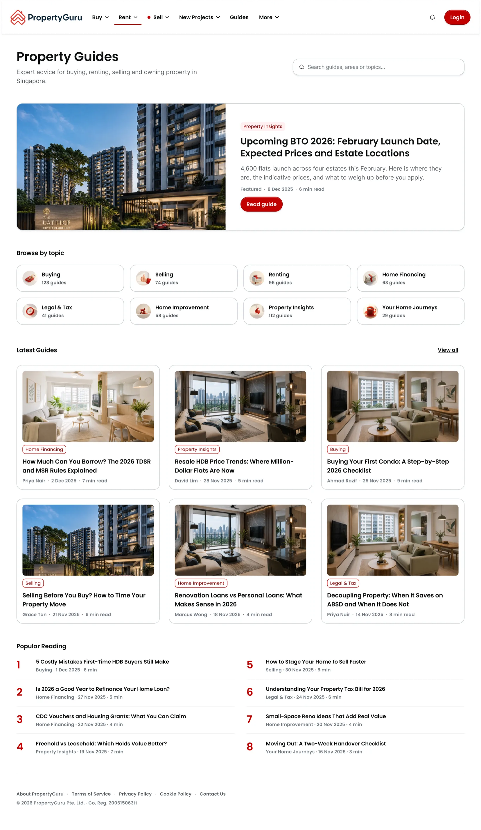
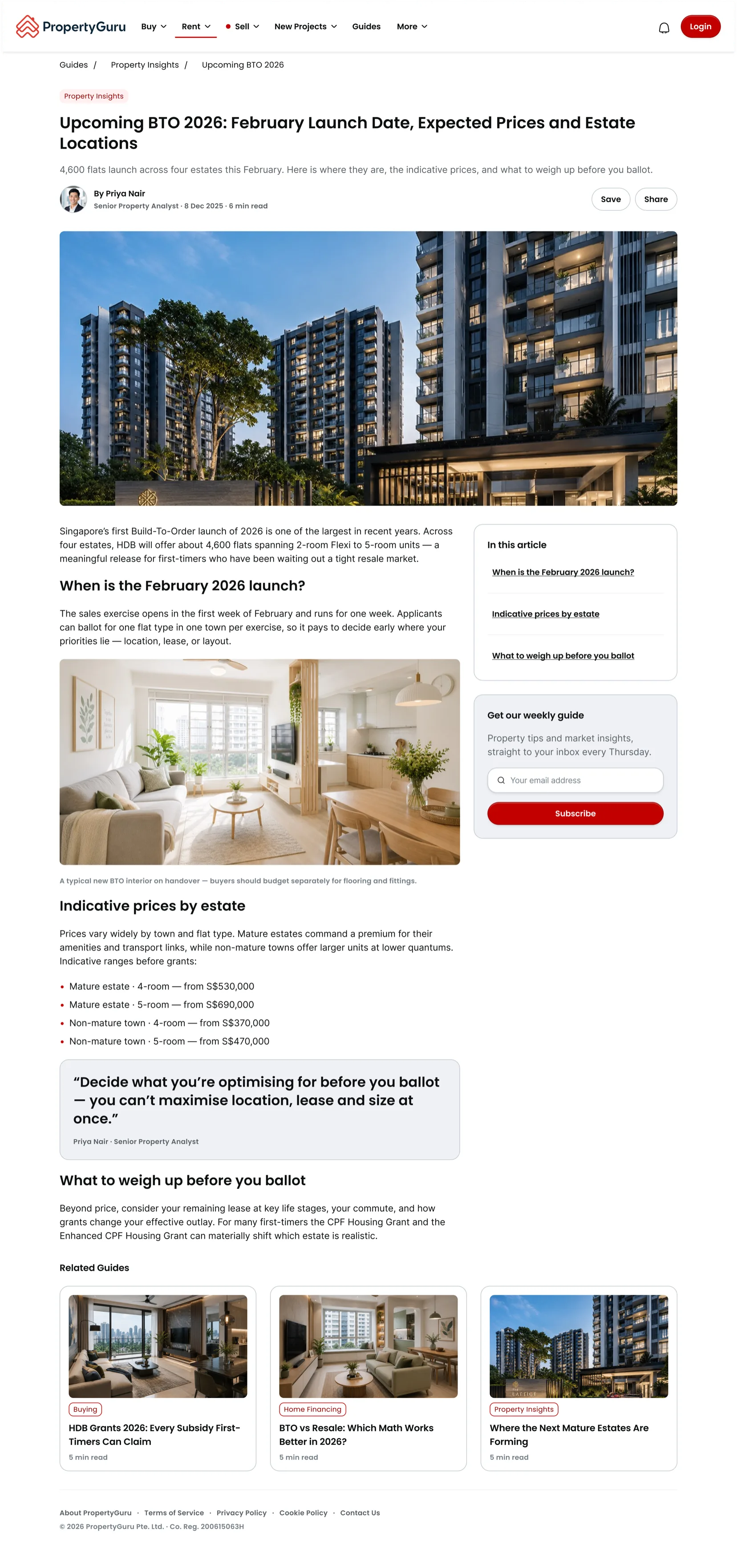
Nothing in the brief said "put the popular list in a numbered column", or "give the article a sticky contents rail". A page with that much on it needs them, so it made them. Click either to read it properly.
And screens that click back. Feed the finished screens to a second file and it hands back a prototype you can type into, filter and tap. When I onboarded designers to all of this, the prototype in the deck was not a screenshot of a prototype. It was the prototype, running inside the deck.
The five I packaged, and the one that makes nothing
- HiveGenFlash Screens from a brief, in any of four forms, in minutes rather than an afternoon.
- HiveProto Those same screens turned into something you can type into, filter and tap.
- HiveBuild New components authored into the design system properly, rather than bolted on beside it.
- DeckGen Decks in the house style, the one I used to onboard designers to all of this included.
- hive-library-researcher Runs before any of them and asks what the system already provides.
That last one produces nothing at all. It runs first and asks a single question: what does the design system already provide for this? Then it hands the answer to whatever is about to start work, and if it is not confident enough in its own answer, it stops and asks a person.
It has no runs recorded against its own name, because its output is always consumed by something else. That is the correct outcome for a pre-flight check, and it is why I nearly forgot to count it.
The day one of them hung
On 12 June a file ran for twenty minutes, reading its own references over and over, producing nothing. A shortened name in a summary made the assistant doubt its references, so it went back to check, which produced another summary, which made it doubt them again.
Three fixes came out of that day. Load references when they are needed, not at the start. Cap the preparation, with a running note of what has been learned so far, so an interruption costs one read rather than a restart. And cut the file: I shortened it by 16%, from 2,726 lines to 2,287. Long instruction files feel thorough, and under pressure they are the first thing to fall apart.
Each fix went into the file next to the failure and the date that caused it. Rules without reasons get deleted by the next person who finds them inconvenient, including you, in four months.
One rule holds the rest up: a session never edits its own instructions. A run may only record what it noticed, and a review each afternoon approves it, rejects it, or parks it. Fifty-one lessons are on record and twenty-one have made it through the gate. A slow gate beats no gate.
What one other person's run proved
I packaged five of the twelve to share, and packaging turned up four faults, because having something installed and downloading it fresh are not the same act. Some fixes existed only on my computer. One file had my own folder paths baked in. My working scraps would have shipped alongside the real thing. And my instructions pointed people at a private location nobody else could open, so every one of them would have hit a wall on step one.
Test by installing into a fresh, empty account, not by running what you already have.
Then one designer ran a shared file on their own machine, and I went through the recording line by line.
It worked. Three screens built, checked, delivered, and it found and fixed a broken icon on the way. It also took 50 minutes against a target of 8 to 15, for three reasons I would never have found alone: it stalled when the assistant hit a limit and discarded a plan it had already made, it choked on loading every reference at once, and it lost three minutes to a false alarm on a first run.
All three are fixed. Every one of the nineteen fixes I made that week came from a failure in somebody else's hands, not mine.
The half that counts
AI can execute in minutes. Deciding what is worth building is still your job.
Twelve files, 196 runs, fifty-one lessons on record, and one other user. The first three numbers took a few weeks each. The fourth took months, and it is the only one that decides whether any of this outlives me.
So: write the instruction file, then break it in front of somebody else. Mine goes to a second designer next, and I will audit that recording the same way.