One of the my early tasks after joining PG was to spend some time with PropertyGuru agents to understand how they actually worked. One conversation stuck with me. An experienced agent in Singapore walked me through her typical morning routine - she'd already responded to a dozen WhatsApp messages before her first coffee, had three property viewings scheduled back-to-back, and was trying to figure out which of her forty new leads from the past week were worth prioritising.
When I asked how she kept track of everything, she pulled out her phone and showed me a notes app filled with lead details, a spreadsheet she updated when she had time, and admitted she mostly just responded to whoever messaged most recently because she had no other way to prioritise.
That conversation shaped how we thought about what we were building.
"I know I'm missing opportunities," she said. "But there's only so many hours in a day."

The Chaos We Found
PropertyGuru agents don't work like most professionals. There's no quiet desk time. No focused deep work sessions. Their day is constant motion - viewings, calls, negotiations, more viewings. And leads come from everywhere: phone calls, SMS, email, our platform, competitor platforms, referrals, open houses.
Most agents we talked to had developed their own systems. Spreadsheets. Notebooks. Color-coded sticky notes. One agent showed me his approach - a WhatsApp group where he messaged himself lead details because at least then he could search for them later.
These weren't lazy people. They were professionals drowning in information with no life raft.
When a home seeker contacts an agent through PropertyGuru, we create a "Lead" with all their details. On paper, this sounds helpful. In reality? It was one more notification in an endless stream. No context. No priority. Just another piece of data in the flood.
The problem wasn't that agents had too many leads. It was that they couldn't see which leads actually mattered.
Defining What to Build
We started with three questions that kept coming up in our research:
How do we help agents prioritize? A family relocating for work in two weeks has very different urgency than someone casually browsing neighborhoods. But without context, agents treated every lead the same - which usually meant responding to whoever messaged most recently, not who needed help most urgently.
How do we reduce the mental load? Agents make decisions on the move. Between viewings. In car parks. While walking to the next appointment. Complex interfaces don't work when you're juggling your phone, keys, and a property brochure.
How do we fit into their existing chaos? We weren't going to replace every tool agents use. We needed to slot into their workflow, not demand they learn an entirely new system.
Version 1: Just Make It Work
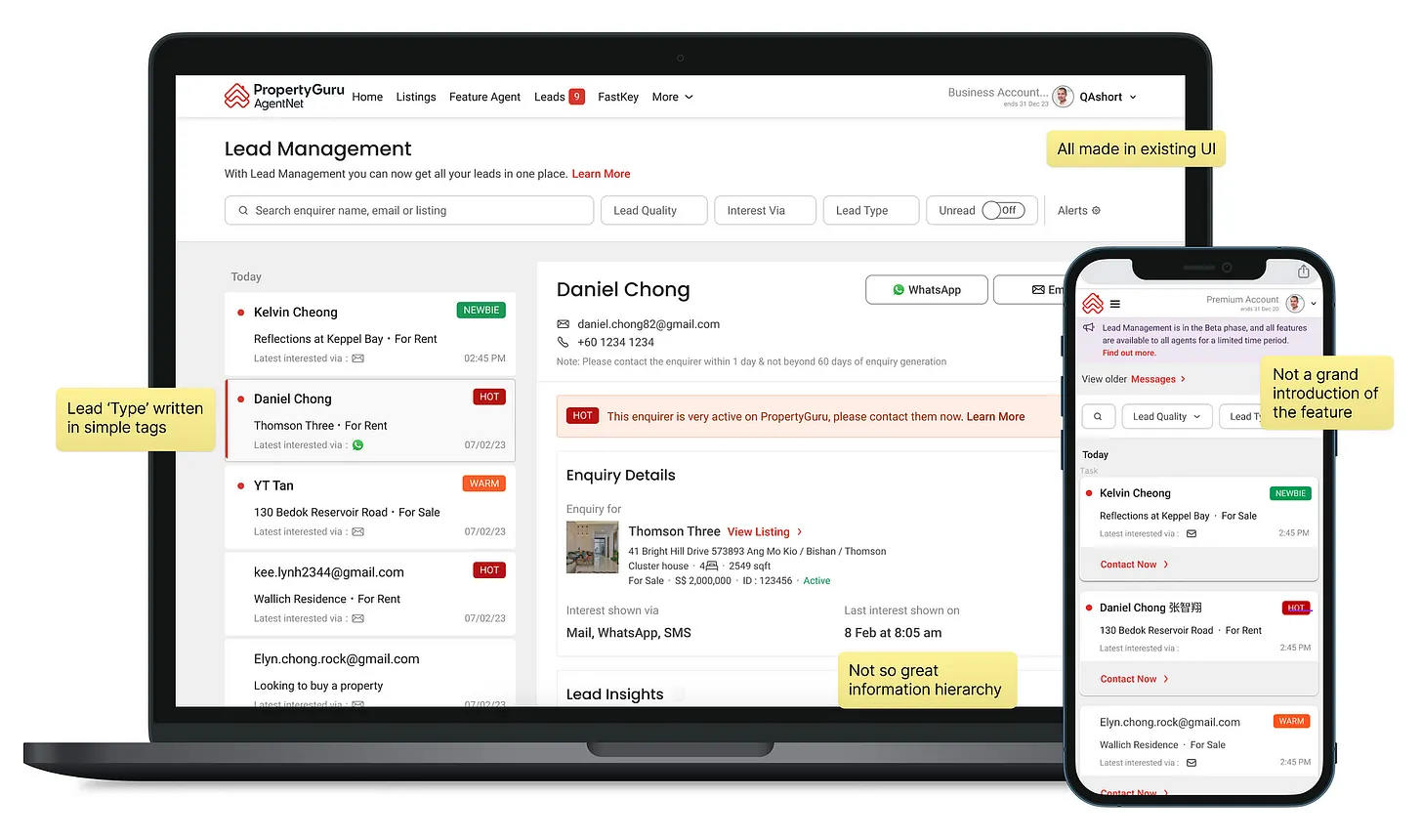
Our first version was pragmatic, not pretty. Get all PropertyGuru leads in one place. Show them as a list. Let agents add notes. Built with our legacy framework because shipping fast mattered more than shipping beautiful.
We tested with power users in Singapore. The feedback was encouraging but incomplete. They loved the consolidation - finally, one place to see PropertyGuru leads. But they still couldn't prioritize effectively. Scrolling through a hundred leads in a list wasn't much better than checking a hundred emails.
One agent told us: "This is helpful, but I still don't know where to start my day."
That hit hard. We'd solved the consolidation problem but not the cognition problem.
Version 2: When Two Stories Converged
Around this time, something interesting was happening in parallel. We were building HIVE - PropertyGuru's new design system. And I mean actually building it, not just designing pretty components in Figma.
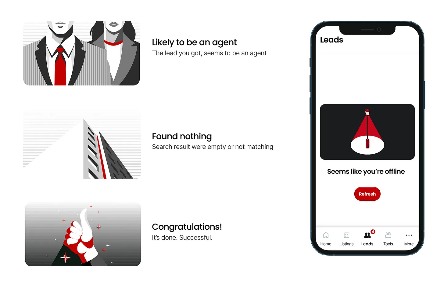
Our engineering team had spent months creating production-ready React and React Native components. Bottom sheets that worked smoothly on any device. Filter patterns optimized for mobile. Empty states that communicated clearly. An icon system designed for instant recognition. All documented, all tested, all ready to deploy.
Most teams in our position would ship LDM v2 with the old visual language and call it done. Safer. Faster. Less risky. But we saw something else: an opportunity to prove HIVE could handle real production pressure while simultaneously making LDM genuinely better for agents.
Here's the thing about design systems that most people miss - they're not about making things look consistent. That's a side effect. The real value is having battle-tested patterns you can deploy quickly. Patterns specifically designed for the kind of problems your users actually face.
For LDM, that meant: information density without overwhelm. Mobile-first interactions that work one-handed. Quick actions that don't lose context. Visual communication that works without reading.
We made a bet: ship v2 on time, with the new design system integrated, and focus our energy on the product experience problems agents actually cared about.

Making Data Make Sense
The core design challenge wasn't technical - it was cognitive. How do you help someone understand 100+ leads at a glance and know exactly where to focus first?
We designed three layers of intelligence:
Visual hierarchy that tells a story
Every lead type got distinct iconography. Not decoration - functional communication. An inquiry about a specific property looks different than a general neighborhood search, which looks different than a return visitor. Agents could scan their lead list and understand context in seconds without reading a single word.
This is where HIVE's icon system became invaluable. We weren't inventing one-off icons for LDM. We were using a consistent visual language agents would see across every PropertyGuru tool. Less to learn. Faster recognition. Better decisions.

Prioritisation that surfaces itself
We took response time expectations, lead freshness, and engagement history and brought them front and center. Not buried in a detail view. Right there in the list.
An agent opens LDM and immediately sees: "This person inquired 10 minutes ago and is actively viewing three properties in your coverage area."
That's not just information - it's an action trigger.
The challenge was displaying this much context without overwhelming mobile screens. HIVE's spacing system and typography hierarchy made it possible. We tested seven different layouts. The system's constraints actually accelerated iteration - we weren't debating spacing values or font sizes, just information architecture. The hard stuff. The stuff that matters.
Actions that match intent
Instead of generic "contact lead" buttons everywhere, we designed context-specific actions. Hot leads show "Call now." Research-stage leads show "Send recommendations." Return visitors show "View conversation history." The interface guides behavior based on what makes sense for that specific lead, not generic CRM actions.

Speed > Features
Throughout development, we cut dozens of features. Some were genuinely clever ideas. Some would've looked great in demos. But they all had one problem: they slowed down core workflows.
Agents need fast and simple more than comprehensive and complex. They need tools that disappear into their workflow, not tools they have to think about.
Having HIVE ready changed how we worked. We spent our time on problems that actually mattered to agents - prioritization logic, notification strategy, workflow optimization - instead of rebuilding basic UI components or debating button styles.
The system didn't make our product decisions. It removed the friction that usually slows product iteration down.
We iterated on five different lead card designs in three days. We tested multiple notification strategies without rebuilding UI each time. We shipped on time while actually improving visual quality, not compromising it.
That's the part about design systems most people miss. It's not about consistency for consistency's sake. It's about removing the bullshit that prevents you from focusing on what actually matters to users.
Testing With Real People
We put LDM in front of agents at different experience levels. Different markets. Different working styles.
New agents loved the structure. It gave them a system they didn't have before - a framework for managing leads they were still learning to handle.
Veteran agents were skeptical. They'd developed their own systems over years. Why change now?
But then they saw the prioritization features. The context at a glance. The one-tap actions.
One veteran agent told us: "I've been doing this for twelve years. I thought I had it figured out. This actually saves me time."
That's when we knew it worked.

The metric that mattered most: agent response time to hot leads dropped by 40%. Not because they were working harder. Because they finally knew which leads to focus on first.
The Ripple Effect
LDM changed how agents interact with PropertyGuru. We went from being a lead generation tool to being a lead management partner. Agent retention improved. Lead response rates improved. Home seeker satisfaction improved.
But something else happened that we didn't expect. LDM became proof - internal proof - that HIVE could handle real production pressure. Not just make things look consistent. Not just speed up design handoff. But actually accelerate product development while improving user experience.
After LDM shipped, conversations about HIVE changed. It wasn't theoretical anymore. It was real. Working. Making a measurable difference.
Key Takeaways
Respect the agent expertise
Agents know their job infinitely better. My role wasn't to teach them how to sell property. It was to remove friction from what they already knew how to do.
Speed beats features every time
Professional users don't want comprehensive tools. They want fast tools that solve specific problems. Everything else is noise.
Design for interruption, not focus
Most product design assumes uninterrupted attention. Professional users in the field never have that luxury. Every interaction needs to work when someone gets pulled away mid-action.
Systems enable better product thinking
When you're not rebuilding basic UI for every project, you can focus on the problems that actually matter to users. HIVE didn't make LDM successful. But it made it possible to focus on what would make it successful.